I find myself getting more and more curmudgeonly over time. I bought a receiver for my tv, but i found configuring it to be arduous. I use new software and wonder if i'm missing something by only skimming the menus rather than devoting myself to them.
As an unfashionably nerdy child, i consumed product manuals and software specs with vigor. I was a master VCR programmer. I was an early tech support weenie. The common retort to this is "Young people have energy."
But maybe it wasn't a matter of energy (you're free to disagree) but an easy comfort to relish in Rules; to understand and play out the system someone else had designed for me to live in (absolving myself the responsibility of choice).
There's an interesting article from Harper's Magazine1 about the concept of a "Democratic Spirit" via the (now prosaic) notion that language is shaped and observed by two camps, Descriptivists and Prescriptivists2. You can look anywhere and find these sorts of folks: the kinds that are fascinated with following rules for a system (meet anyone with a vague interest in DnD) and those that are like cultural sponges, remixing style and systems to suit their needs. And it's not a binary-choice either, it's more like a gradient between the two.
Design is an opinionated field, informed by concepts like "systems" and "visual languages" and semiotics. The AIGA describes design as a "creative process that combines art and technology to communicate ideas." and design crits are littered with gems like "it just doesn't speak to me" or "what is this trying to say?" That design is a communicative medium should surprise nobody, least of all designers. It should also be no surprise that there are two camps of designers: the kind that treat design
Folks, myself included, like to make the distinction between "design aesthetic" and "design function" as if they're different things, but from a certain standpoint they're both a kind of vernacular; each is a style and method for making a point. Sometimes 'how you say it' is as important as 'what you say.'

Let's go back to tv receivers & software. When it comes to things like software and hardware, there's this Jakob Nielsen/Don Norman-esque belief that objects should be obvious, clear, reuse metaphors, etc. These are not bad goals at all. Interaction and interface design are important because they aim to create intelligible and reusable mental models for what are often complex ideas.
Over time, these ideas coalesce into a semi-standardized design language. At their outset, though, apps and devices try to find a way to express their newfound utility and differences through icons, metaphors and novel interface elements3. John maeda once noted4 that his digital camera's manual was twice as large as the one for his Volvo sedan. Digital camera technology still, to some degree, actively improves "the basics" enough that we still need to deal with these changes. In contrast, cars largely refine existing features nowadays rather than innovating fundamental things like the accelerator. If your car gets an upgrade these days, you don't need to relearn how to use the brakes or accelerator.
The goal of converging standards in ui design is to democratize the components of interfaces. In the development of indexhibit, daniel eatock said that he wanted to create 'archetypal' online portfolios which democratically favored content rather than the design of the portfolio. Back when voicemail wasn't tied to a touchscreen ui, you could mostly count on the 7 key to mean 'delete'. When navigating indexhibit, you know what the portfolio contents are. When using a doorknob, you usually know how it's going to behave.
Standards exist to simplify common things, which is goood, nobody disputes that.
There's a term for a certain flavor of exaggerated gramattical etiquette called "hypercorrection"5 where people, afraid of sounding 'stupid' always use "I" instead of "me", despite the word "me" being 'more appropriate' in the context as a grammatical object. Languages and their grammars have lots of rules, mostly so you can make a point as unambiguously as possible to as many people as possible.
In design, as in a grammar, these rules are often byzantine. There are accepted numerical guidelines for justifying text in inDesign on the numeric end and there are flavor-profiles for mixing and matching type on the abstract end. There are rules as to what you can do and what you shouldn't do and what has, historically, looked 'good,' and what "Golden Ratios" and musical scales have been used since time immemorable. These rules are passed down in the best Prescriptive manner by instructors and classmates.
Graphic Design is largely prescriptive. It thrives on correct things and as a result it has its fair share of hypercorrection. Why do so many designs look similar? Why do hierarchies often look the same between websites? Why are standardized grids so common? Part is pragmatism but the other part is often falling back on standards. But when you start falling back on prescriptive rules and pre-fab systems to Design something you are consciously making a choice to make that aspect of your design invisible. This is roughly the same argument for using Standard Written English to make your point.
My impression has been that Fine Artists think this manner of rule-using and setting is laughable since Fine Art thrives on people challenging norms and conventions. As in Fine Art, Design rewards 'successful' challenges to convention. The successes are duplicated, they evolve, they change, they take on a life of their own. They are memes in the highest-brow sense. The others are simply 'wrong' until a subculture fetishizes them and champions them on their own merits6.
For an example of this, you can look at David Carson, the poster-child for designers wanting to tout that "design doesn't have to play by the rules." And, since he existed at a time when grunge was very much culturally de stijl, you can witness the accompanying success of his cohort of zuzana and neville and paula and stefan and all the gang who just wanted to eff things up real nice7. The exact same people who massimo was very publicly pillorying and, if you've watched Helvetica, you can see him slighting with gusto.
To say that Design, as a field, is conflicted about its place in the Art world is something of an understatement8.
The comedy of iOS7 was chiefly the 'designer reaction,' mostly for their bare-fisted prescriptivism (at quantities unseen since the reveal of wolff olins' london 2012 logo9). iOS7 was all wrong they said. Helvetica as system font was wrong. The grid was "OK", but its application was wrong. Even the gracious crits toed the party line vis-a-vis type, color, icon design, etc10.
Then, just as soon as the crits began, the consensus turned again to the fact that iOS7 wasn't complete yet, and finally that we were judging iOS7 prematurely.
But the point is not that iOS's design was divisive (uninteresting) but that the kind of reaction is highly divisive. You see arguments that fall back on prescribed rubric, on taste, on 'correctness' and so forth. The opposing viewpoints have mostly centered around "give it time" and "it's new, let's see what happens."11 Certainly there's probably some hedging going on, but a rationale for reserving judgment that centers on "i don't understand what this means yet" implies a descriptivist's assessment that iOS' success is largely dependent on what everyone else does in relation to it.
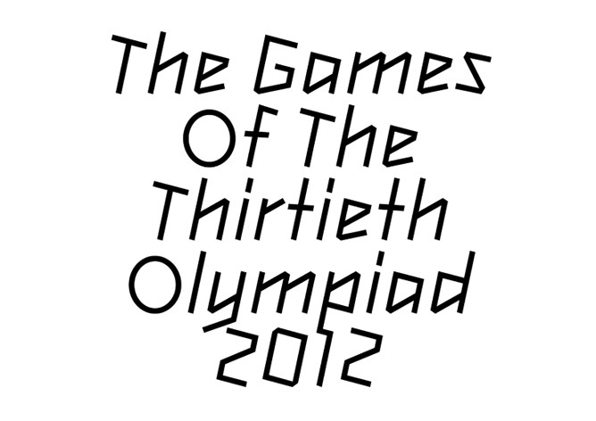
Actually, let me return to london 2012 for a second:
The typeface needed to be part of this world, be linear and graphic, not typographic, not have the formal typographic subtleties of the typefaces its been compared to, or their reference points of blackletter or cartoon.
Such comparisons have missed the point and have not considered idea of the identity or the type in context, or context according to its original brief. Or they have just not liked the identity per se, so have expressed a general dislike of all aspects of the identity, not considering the inadequacies or otherwise of the type as a supporting element to the logo.12
The overarching critique of the games' identity was formal13, but for a system, this is something of a red herring. The above plea is not asking that folks accept the aesthetic choices that produced the logo or font, rather it's begging that people evaluate the type in the context of the logo and the universe it spawned.
And if we tolerate, as a profession, the notion that design is a tool for communication, it is unfortunate that a vocal subset of influential designers expect design to communicate instantly intelligible ideas. Certainly, much of design services simple ideas, but any communication platform will at some stage try to express or present a legitimately new idea. What then?
This isn't an excuse for needless complexity in design. Nobody likes that, but most interaction designs tend to be compromises between convention and the peculiarities of whatever new mental model is being presented14. The canonical example is File Sync (which is Hard, btw). As of 2005, the best solution was something like Unison. And then dropbox showed up and instead of letting people deal with a complex config file, just gave people a magic folder with blue and green icons to let you know if your files had finished syncing. Sync is still hard, but dropbox acknowledged that most people just don't care as long as you create conflicted versions and give them a few gigs of free storage space.
And some conceptual simplifications are helpful but others are leaky abstractions and as a result, when we begin to critique anything new, we look for the familiar and try to make sense of elements we haven't seen before.
- What you get right, nobody mentions it.
- What you get wrong, people bitch about.
- What is difficult to understand you have to explain to people over and over again15
In mathematics, Category Theory16 is a way of Strictly/Formally defining 'things' and mappings or relations between them and how it is possible to combine those relations/mappings. The allure and the beatuy of category theory is that the rules for defining a category are quite straightforward and they allow you to define a rational system from the outset. There can be no ambiguity because in order to get to the point where you're talking about the interactions between mappings and groups, you must necessarily agree with the initial context.
What's appealing is that this system provides you a set of guidelines for understanding how this world works and then lets you figure out how you go about mixing and matching the components in a way that both creates some newish thing also within the bounds of the rules you all agreed to.
The problem with design is that it is not in any way like category theory. The rules are always changing, the way the world deals with design is unbounded and ill-defined. Critics champion random things, rules are broken, people like Wrong Things for reasons that defy logic. And further
But part of this whole vcr love as a child but receiver disappointment as an adult is that I have developed more complex ideas about how receivers could work. A VCR is not a complicated device and, as a six year old, i don't think i had very complex demands of them. But as time goes on, there are more things i expect devices or designs or anything to "get right."
And naturally, in this, prescriptivism is a comfortable stance to take. But you define your own prescriptivism as well, you set down rules for how the world or design or logos should work and those define the edges of what others get right or wrong. I'm not treading new ground here by saying this, we all know this is how taste and subjective opinions play out.
And naturally it's difficult to let go of your own rule-systems: you've invested lots of energy in creating them and there's nothing which objectively proves anyone has it figured out any more than you have.
Here cementing my yuppie bona fides, Tense Present, David Foster Wallace. Haper's Magazine April 2001. I am underselling how great this essay is: it starts by showing the context of the prescriptivist / descriptivist debate and afterwards challenges you to determine which is Right. Fine, but spoilers, the essay then wallops you with a review for a reference guide that does the same thing Wallace does in prose.↩
For the purposes of the article, Descriptivists watch language play itself out and document it as well as they can. Meanwhile, Prescriptivists (as their name implies) prescribe historically correct and proper usage of language.↩
Remember the difference between Winamp and iTunes back in the day (if you remember that far back)?. Winamp was particularly hands-off about your music collection and unskinned, it looked like a piece of component audio hardware. Its main ui element was the playlist editor which gobbled up m3us or whole directory structures. By contrast, iTunes was very much designed to not only play, but collect your music. Playlists were available, but they were secondary to its Library view.↩
This musing appears in his ted talk and also featured prominently in his run-up to his Laws of Simplicity book. And with good reason, it's an astute observation that technological innovation has the capacity to make once-obvious things complicated. Having a tiny screen on the back of your camera is valuable for providing you feedback, but it has the effect of encouraging you to perform your feedback loop as you're taking photos rather than editing your photos much later.↩
garner's modern american usage, Hypercorrection. The problem is not limited to I/me, but also who/whom, and so forth.↩
see for example: pixel art / ascii art / scanner glitches over rococo tapestries / etc↩
or Weingart if you want to go further back.↩
this debate goes pretty much all the way back to the 1920s or so when typographers debated whether or not the title Graphic Designer was an affront towards honest typographers. Is Design layout? Is it Art? Is it Typography? Is it Illustration? These questions (and more) are fodder for most MFA seminars.
Take a second and ask yourself if it's problematic if design aspires to art. For art to be 'successful' do you have to 'get it' the same way you have to 'get' a design? Certainly, design has some leeway to express itself creatively, but is it the same leeway we allow to something like, say, R.Mutt's Fountain)?↩
it's, at this point, not totally beyond the pale to suggest that the logocalypse that was foretold by vocal designers was completely overblown. Why this was an issue at all is ridiculous. Did the logo violate the sanctity of the games any more than the 2000 sydney games or the 2008 beijing games (both of which might as well have been cut from the same cloth)?↩
This is perhaps an unkind assessment of Frank Chimero's honest realization that time smooths over many design wounds but even as rational as his argument was, he couldn't help but get a dig in.↩
om malik's ios7 designer roundup is disturbingly informative.↩
Naturally, Gareth Hague, the designer of Headline 2012, weighed in on the vocal reactions to the 2012 logo. Note, even in this quote and in the rest of his reaction the use of the word 'context.'↩
here i use the word formal as "Relating to the form or structure of something" rather than its more common use as "ceremonial" or "official"↩
This was made apparent to me the first time i used Lightroom and the first time i attempted to use final cut pro. I had zero frame of reference for film and so the whole thing seemed to me needlessly complex. In contrast, when i used lightroom, i immediately understood what they were trying to do, possibly because i had spent plenty of time thinking in "the photo space."
I actually don't know if final cut is considered a Good application, but i do know that i lack a mental frame of reference from which to judge it which makes me think that↩
joe armstrong's Three Laws of Programming Languages re: elixir. It's worth mentioning if it's not obvious that this gem comes from the designer of a Programming Language, a person intimately aware of the limitations of trying to express complex ideas in a strict grammar.↩
another good description with more historical context appears in Spivak's category theory for natural sciences. Here i resist the urge to use the word functor.↩